Skip to overview

Brand Identity · Motion System · B2B SaaS

SAVIO

A telematics analytics identity built on live signal logic. Turning fleet risk into something readable.

  • Brand Identity
  • Interactive Guidelines
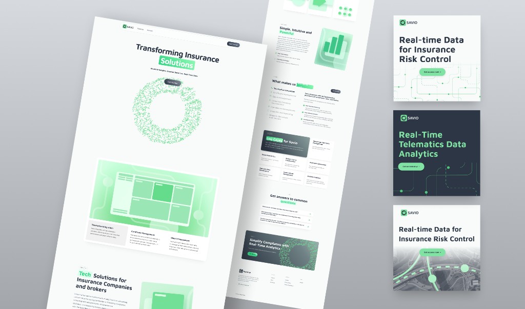
  • Website Design
SAVIO brand board with business cards, signage, notebook, website, icon, and social applications

Identity, motion language, and application direction

SAVIO needed a brand identity that could translate complex transportation data into a structured, readable system.

The platform serves insurance teams working with fleet and transportation clients. The identity had to support risk analysis while standing apart from the blue-heavy visual language common in the category.

The category leans on blue palettes and generic tech visuals.

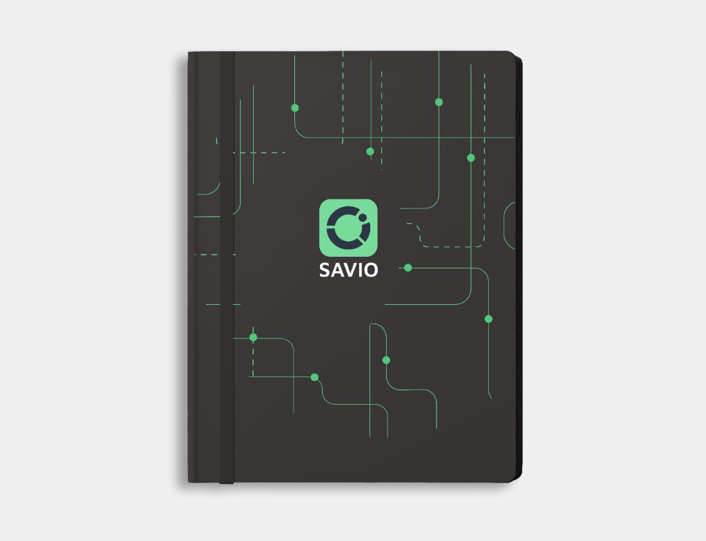
SAVIO takes a different direction. The identity is built on signal logic, where data becomes visible and structured.

The goal was not decoration, but translation. To turn complex fleet data into something that can be understood at a glance.

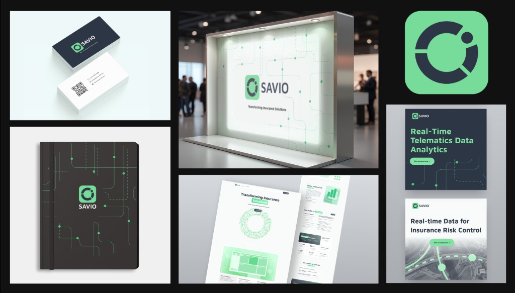
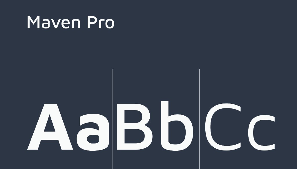
The identity is built as a system: typography, signal patterns, a focused palette, iconography, and clear application rules.

Each element connects back to how the product works, turning data into visible signals.

SAVIO logo construction showing telematics system plus data pie chart forming the fleetwise logomark
The mark combines a signal pulse with a segmented data form, creating a compact symbol of real-time analytics.
SAVIO horizontal main logo SAVIO standalone logomark SAVIO vertical main logo
Logo variations support horizontal, vertical, and standalone use across digital and physical applications.
Maven Pro typography specimen showing uppercase and lowercase characters
Maven Pro introduces a technical tone while keeping interfaces and labels easy to read.
SAVIO color palette with emerald, emerald dark, mint cream, and dark grey
Emerald creates contrast in a category dominated by blue, while mint cream and dark grey keep the system controlled and readable.
SAVIO road-inspired signal pattern
The route pattern builds a flexible background language across web, motion, and collateral.
SAVIO particle ring pattern on a black background
A secondary particle system extends the idea into data-driven visuals for hero moments.
SAVIO custom icon set in green
Custom icons extend the circular logic of the mark into fleet, risk, weather, timing, and analytics themes.
The logo animation turns the mark into a pulsing signal.
Network motion builds a sense of continuous data flow across interfaces and brand moments.

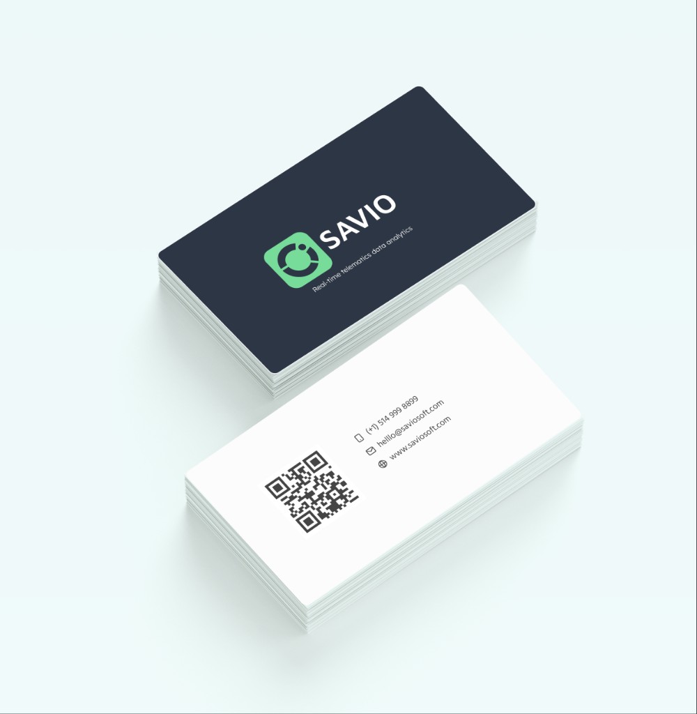
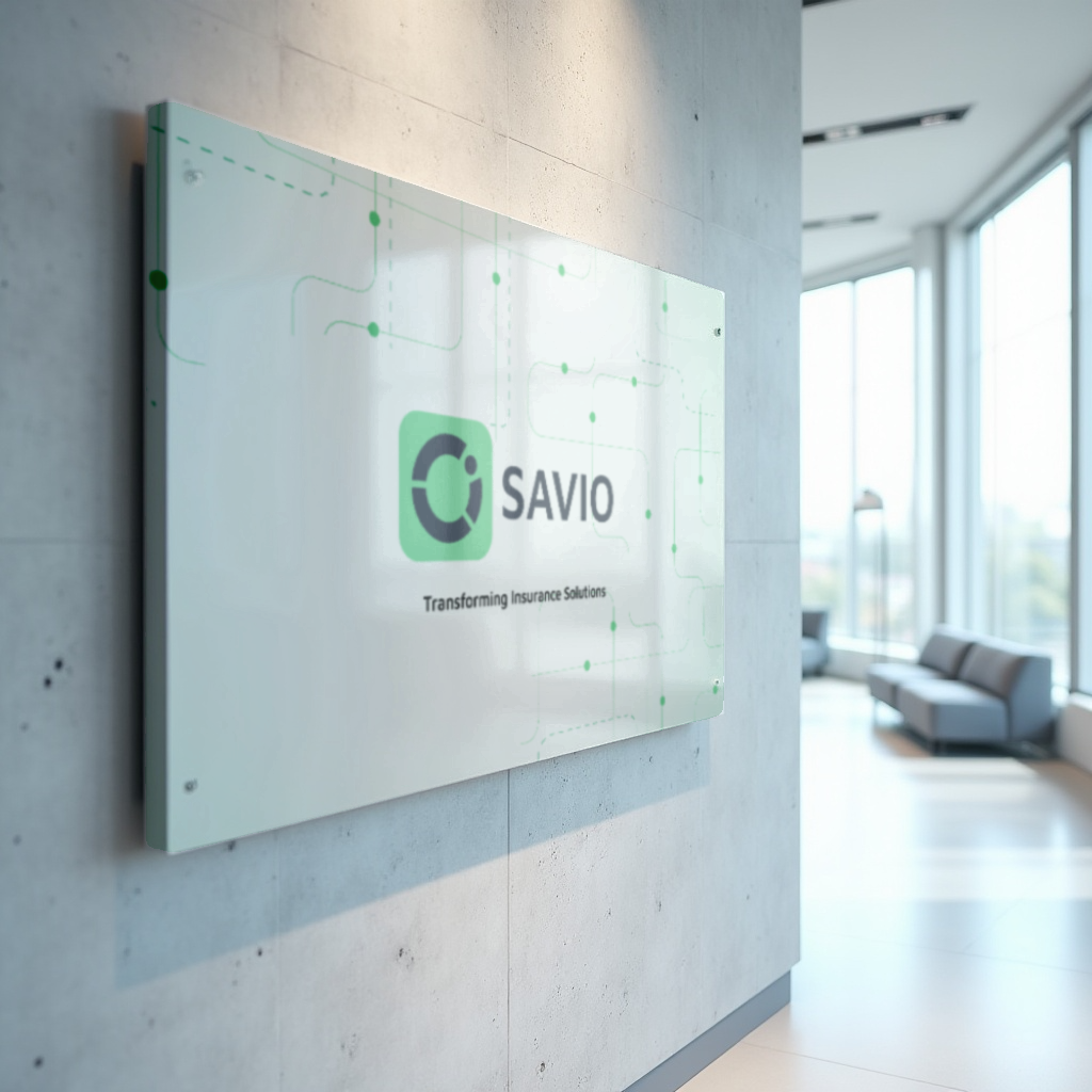
The system was applied across web, social, collateral, and presentation formats to ensure consistency across launch materials.
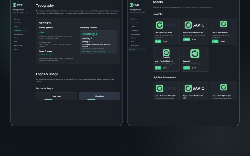
SAVIO website and social mockups showing launch layouts
The website direction translates the signal logic into a clear sales narrative, with social layouts extending the same rhythm across launch materials.
SAVIO business cards with logo, contact details, and QR code
Business cards keep the system restrained, functional, and product-led.
Black SAVIO notebook cover with green data path pattern
Collateral and signage use the pattern as a restrained recognition layer.
SAVIO illuminated exhibition signage with pattern and logo
Large-format signage turns the pattern into an immediate recognition device.
SAVIO office wall signage with logo and green data pattern
Environmental applications keep the system calm, technical, and easy to read at scale.

The result is a brand identity that makes complex fleet data readable at a glance.

SAVIO stands apart from the blue-dominated telematics space while maintaining a clear, technical tone across web, motion, and product-facing materials.