Brand Identity Design for Fleetwise Technologies
Overview:
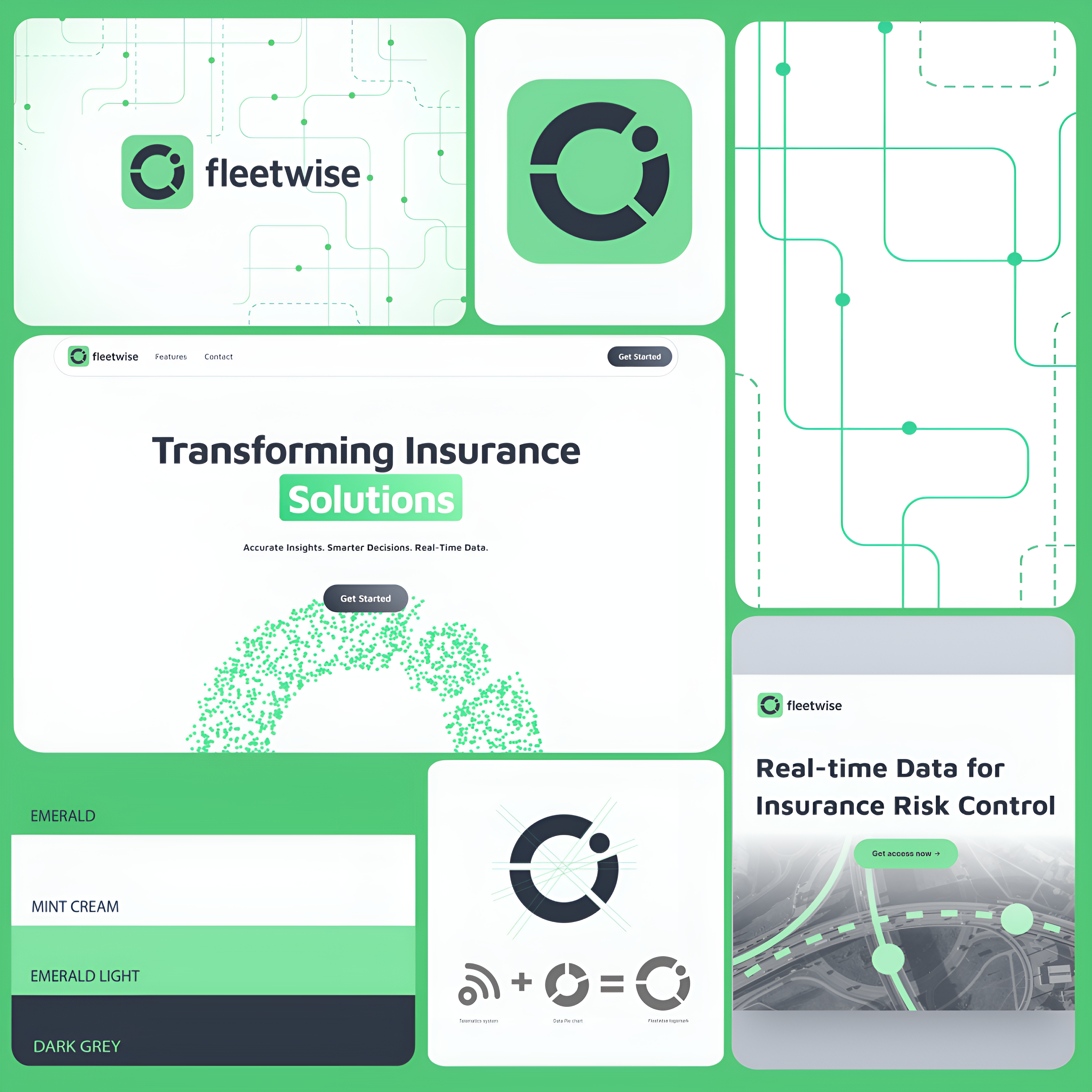
The Fleetwise brand identity project focused on designing a visual system that conveyed the platform's innovative real-time telematics analytics while appealing to insurance companies audience specializing in cross-border trucking.
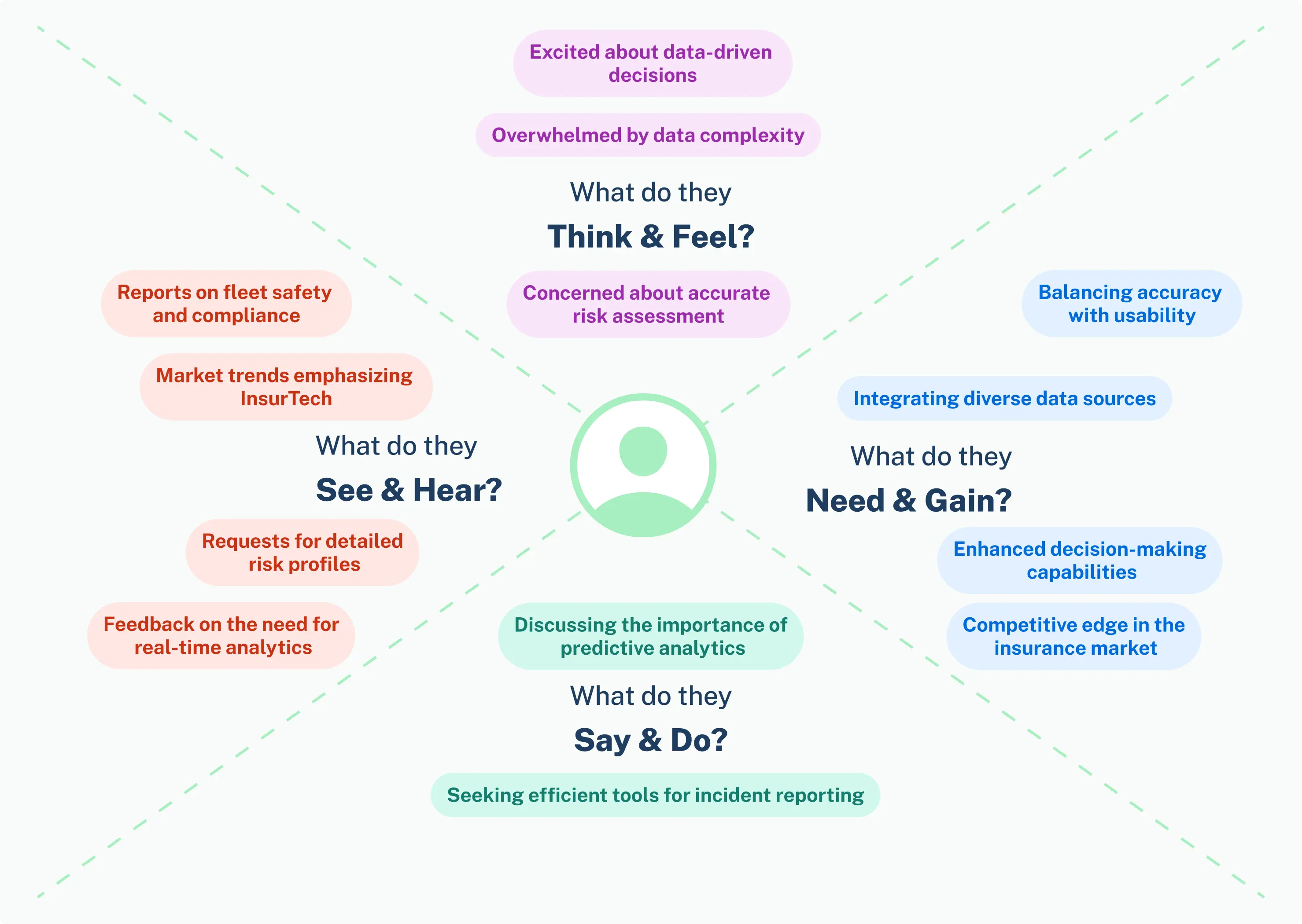
Based on an in-depth brand brief and thorough competitive visual research, I identified customer pain points, key industry trends, and visual cues that resonated with the target audience. This research laid the foundation for making informed design decisions.
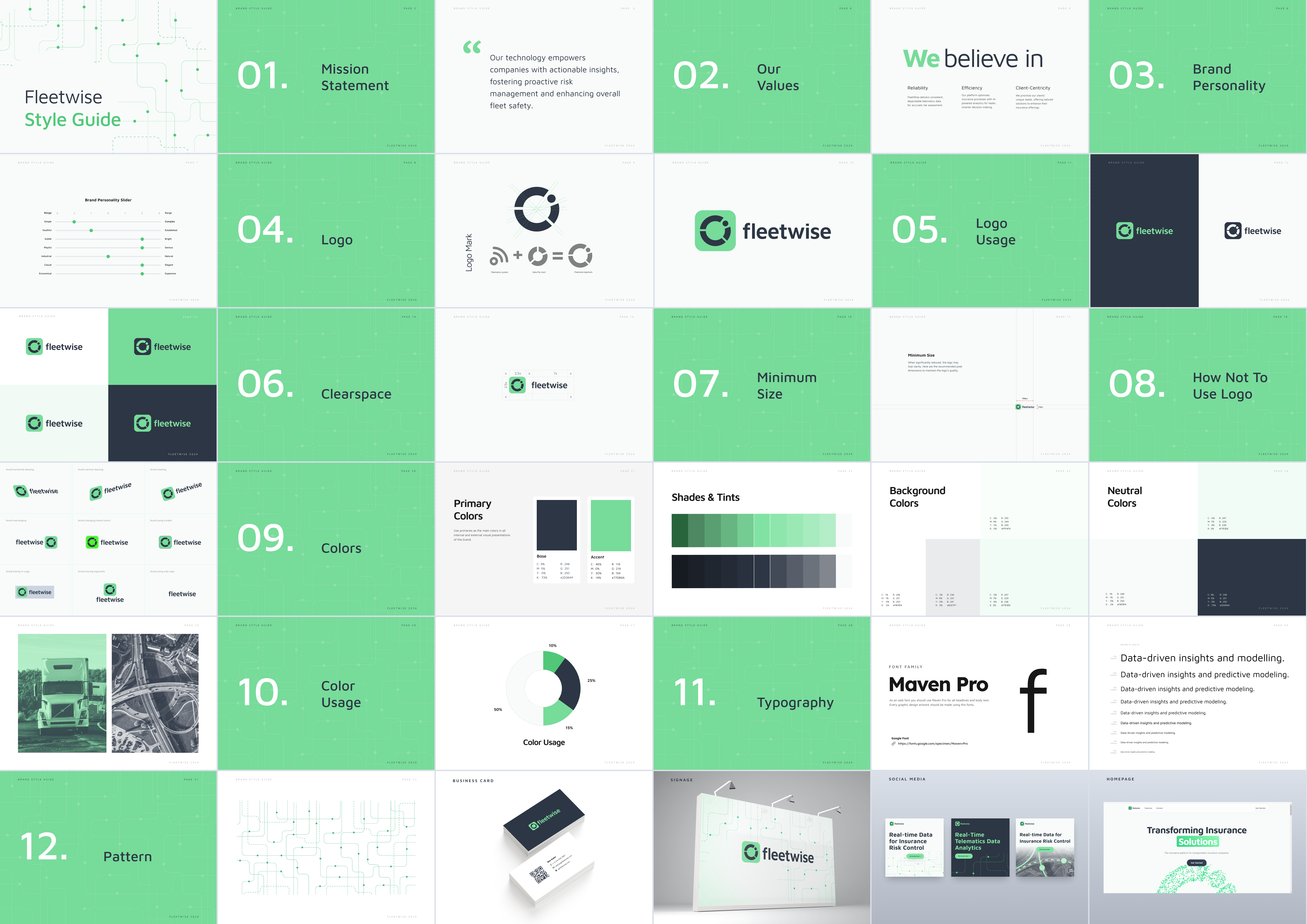
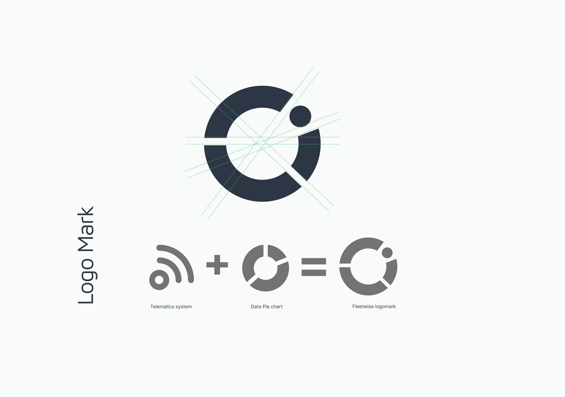
The wordmark integrated pie chart and signal motifs, representing data transformation and connectivity.
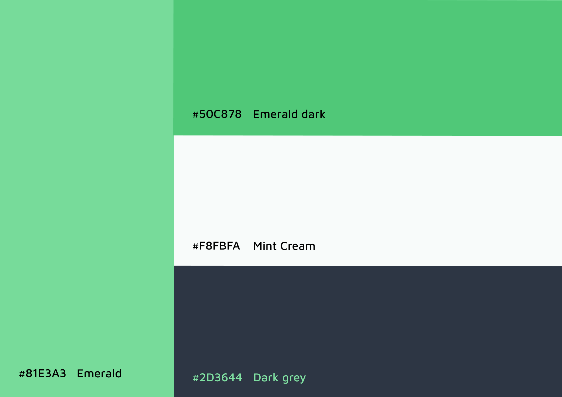
Emerald and dark grey were chosen to symbolize stability, professionalism, and technological
authority, trust.
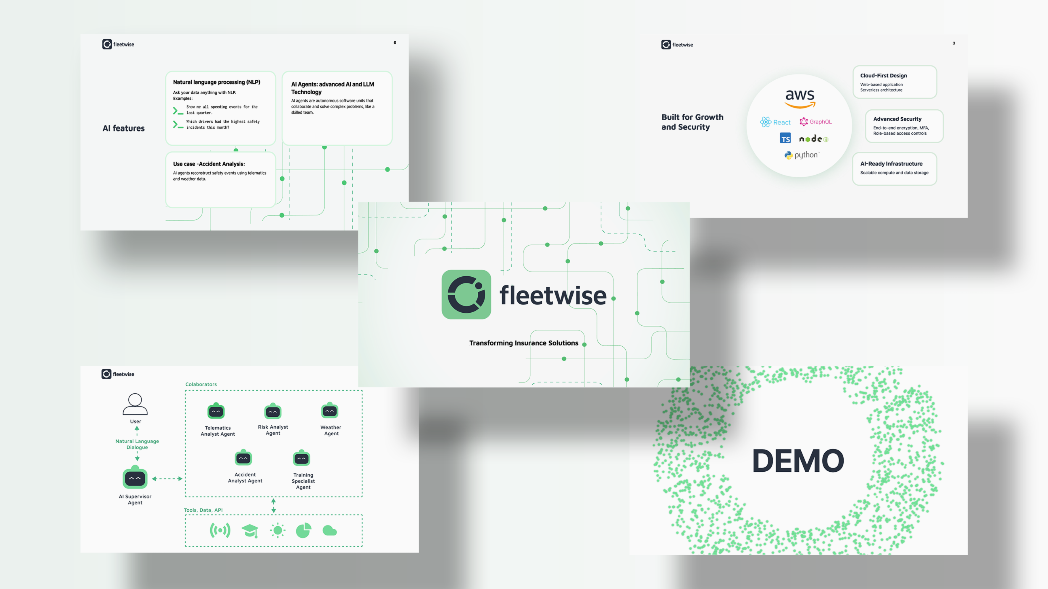
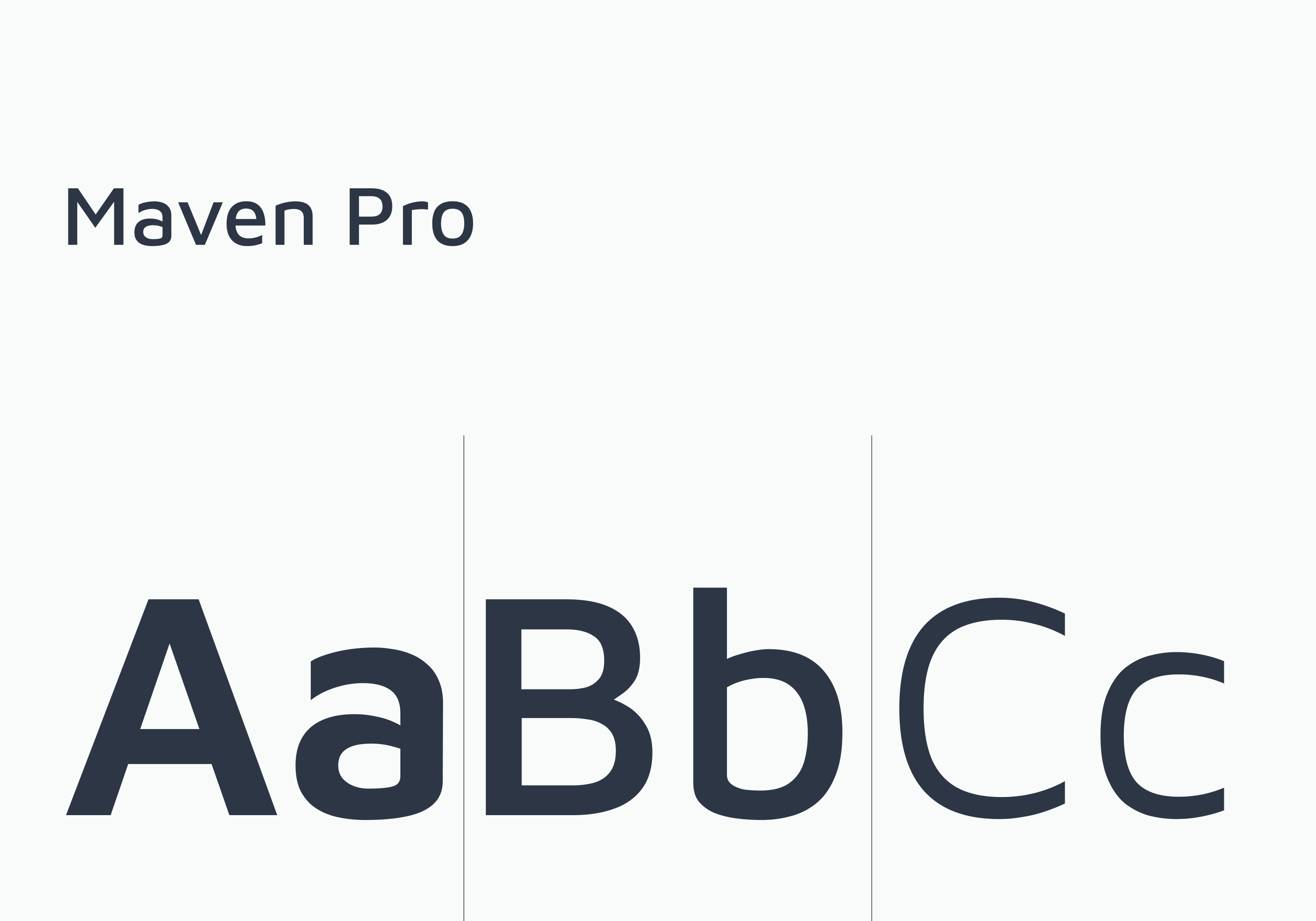
Maven Pro font family ensured a modern, clear aesthetic, while line-and-dot patterns echoed data
networks and roadways, emphasizing Fleetwise's analytical capabilities.
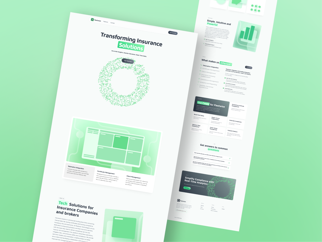
The website design centered on presenting features and benefits clearly, with a white background
and emerald accents for a fresh, professional appearance.
Simplified illustrations, subtle
gradients, and interactive elements made complex data approachable and engaging.
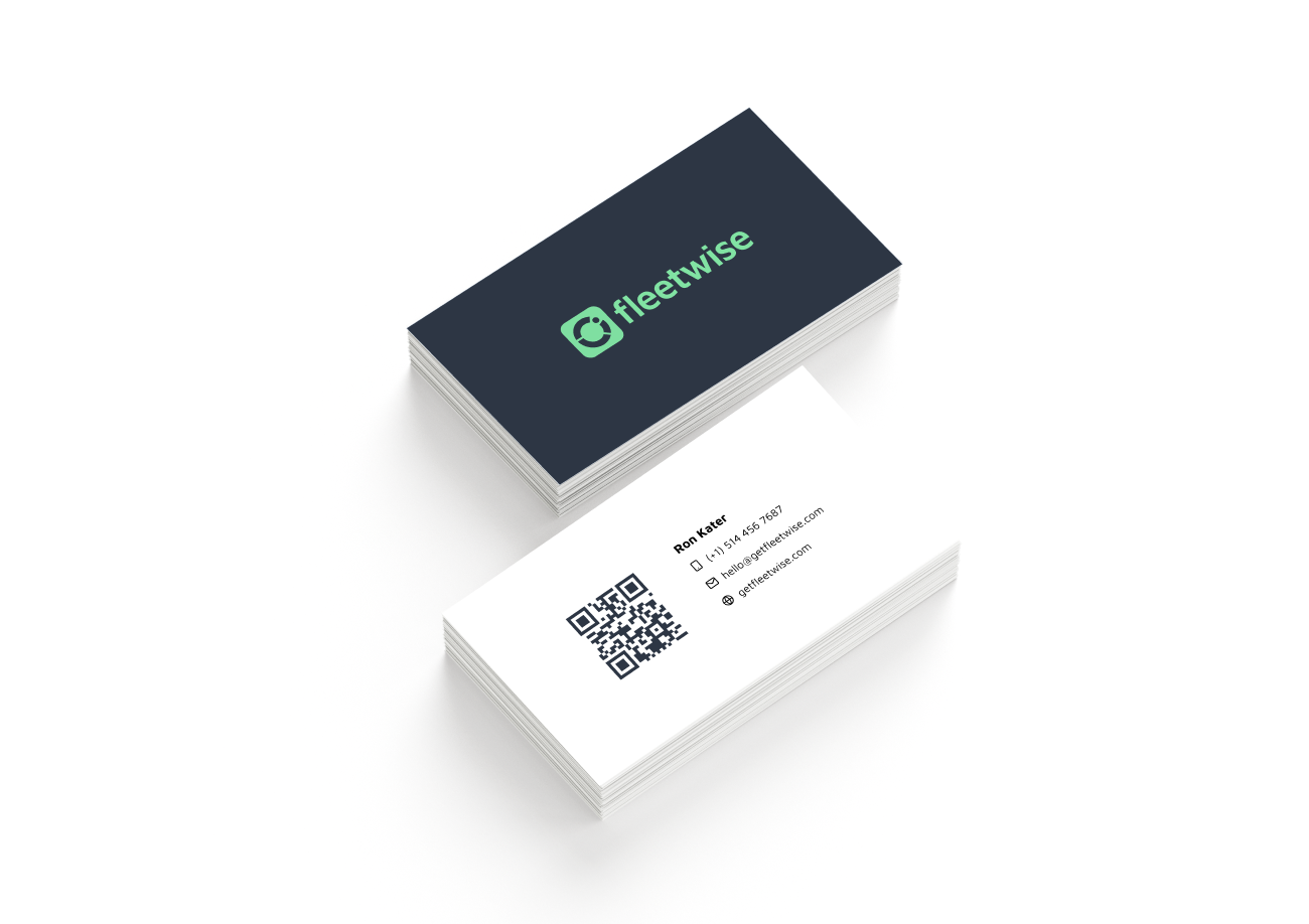
Translated abstract client goals into a visual identity system that feels credible and modern for the insurance analytics industry, solidifying its market position and enhancing user engagement.
.png)
