Brand Identity for GetShip
- Brand Designer
- Visual Identity System
- Sales Deck & Social
- Figma
- Adobe Creative Cloud
Overview:
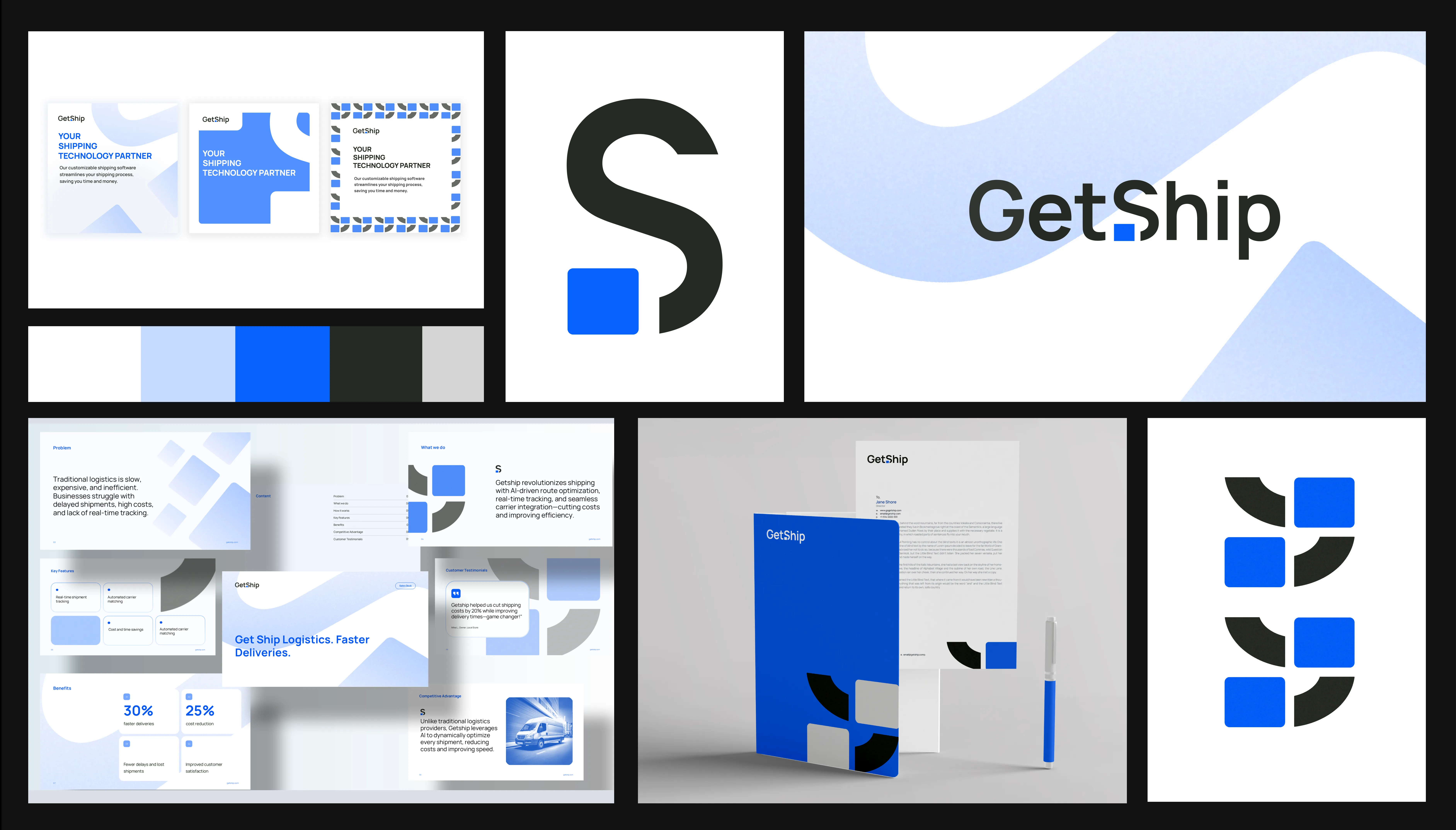
When GetShip came to me, they were navigating a sea of similar shipping tools and needed a brand that captured simplicity and forward-thinking innovation.
I started with an in-depth brand brief interview and thorough competitive visual research, uncovering customer pain points around complexity, and identifying key industry trends and visual cues that resonate with e-commerce businesses and logistics managers.
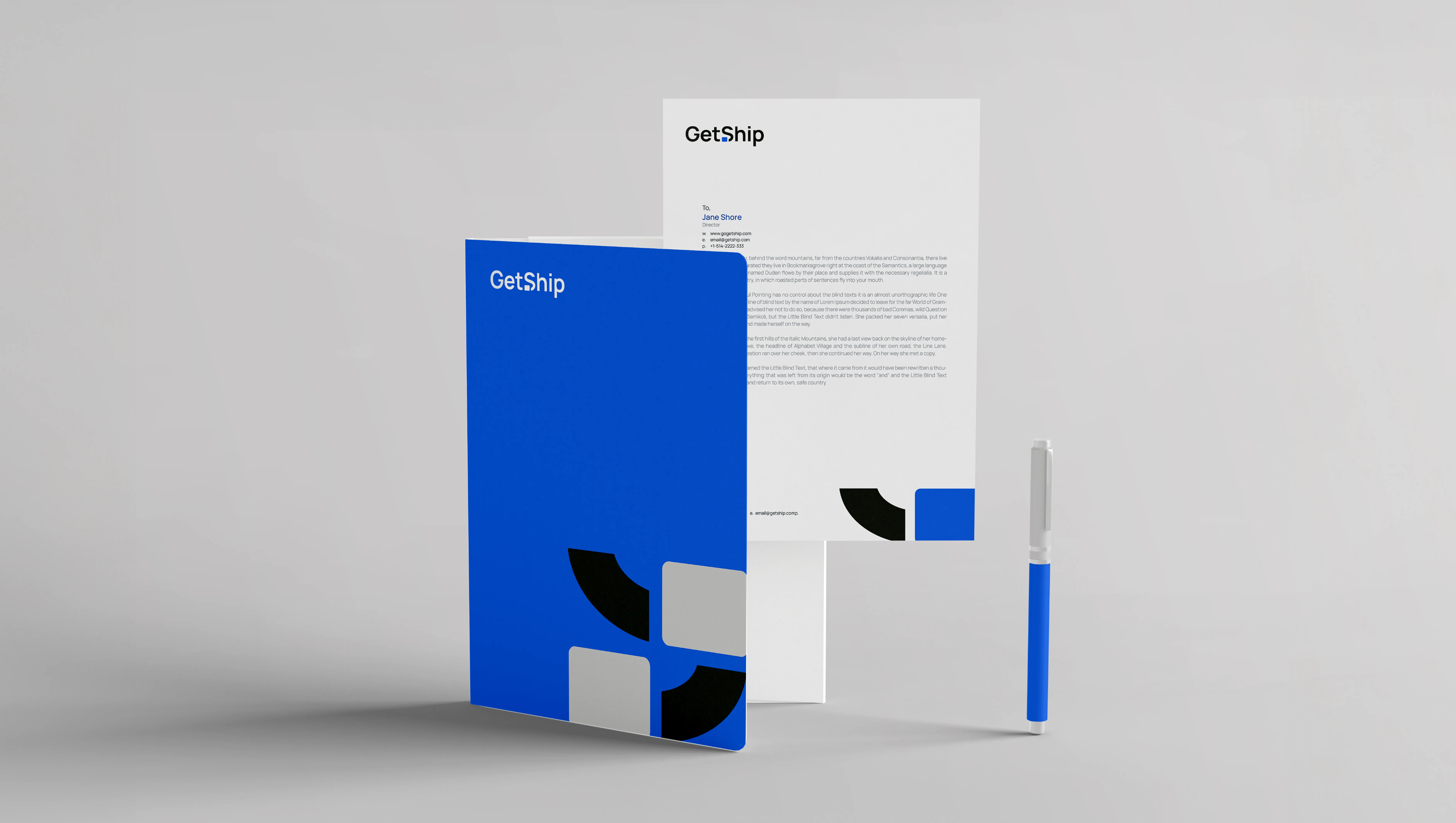
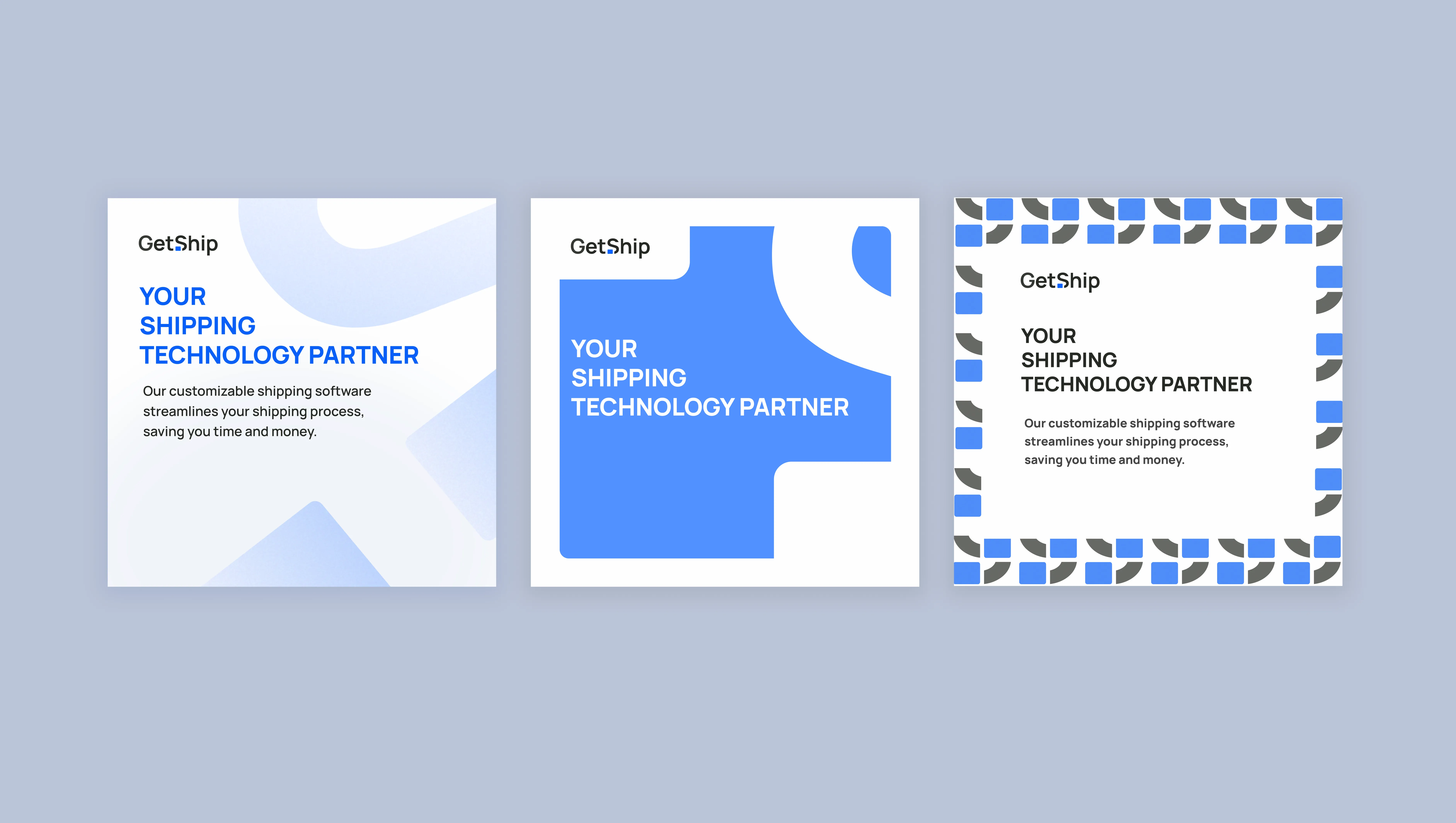
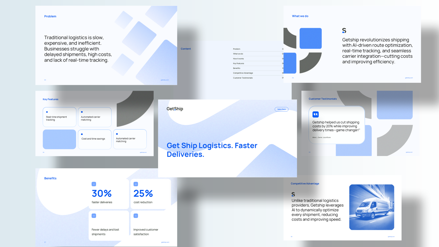
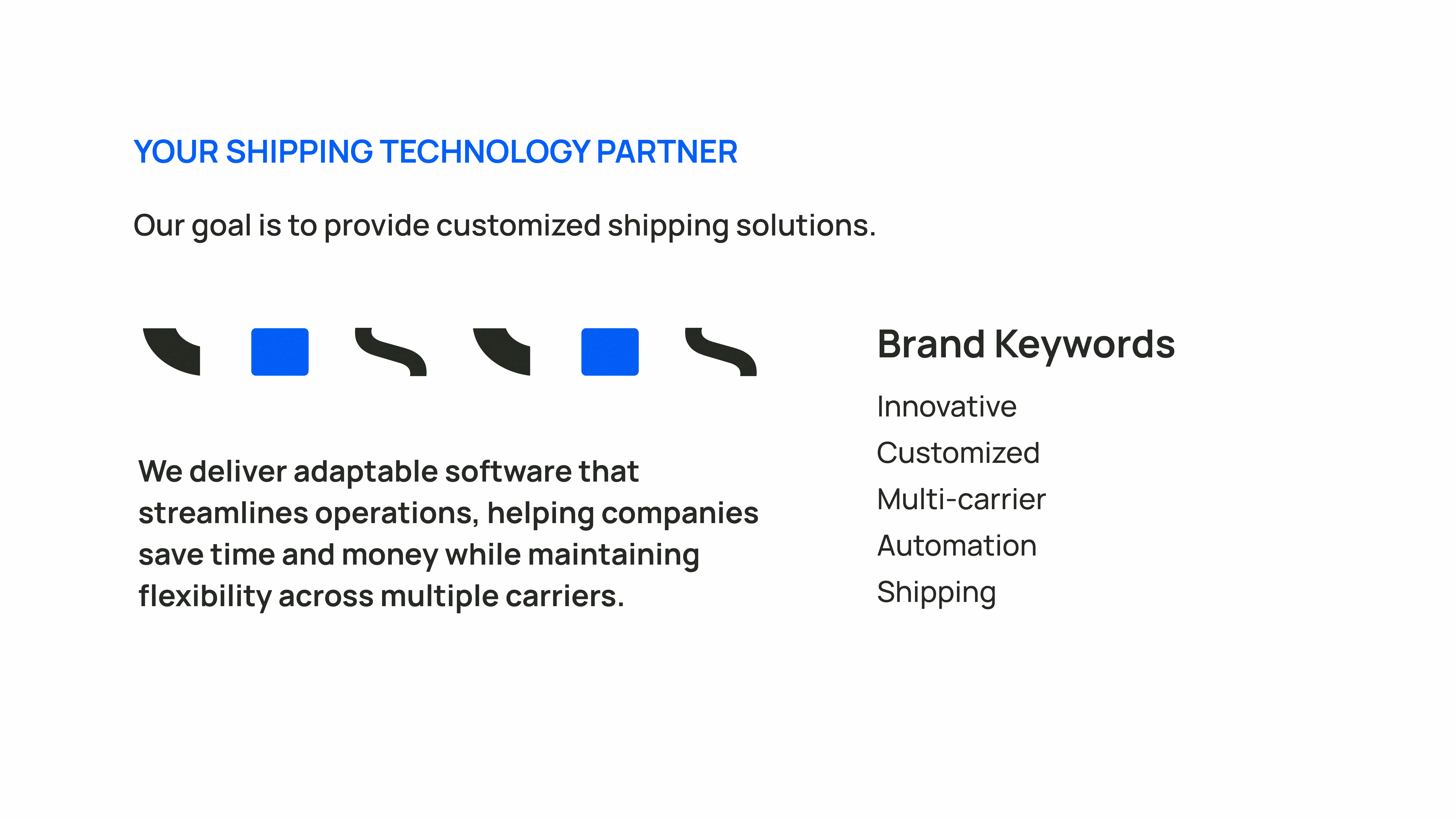
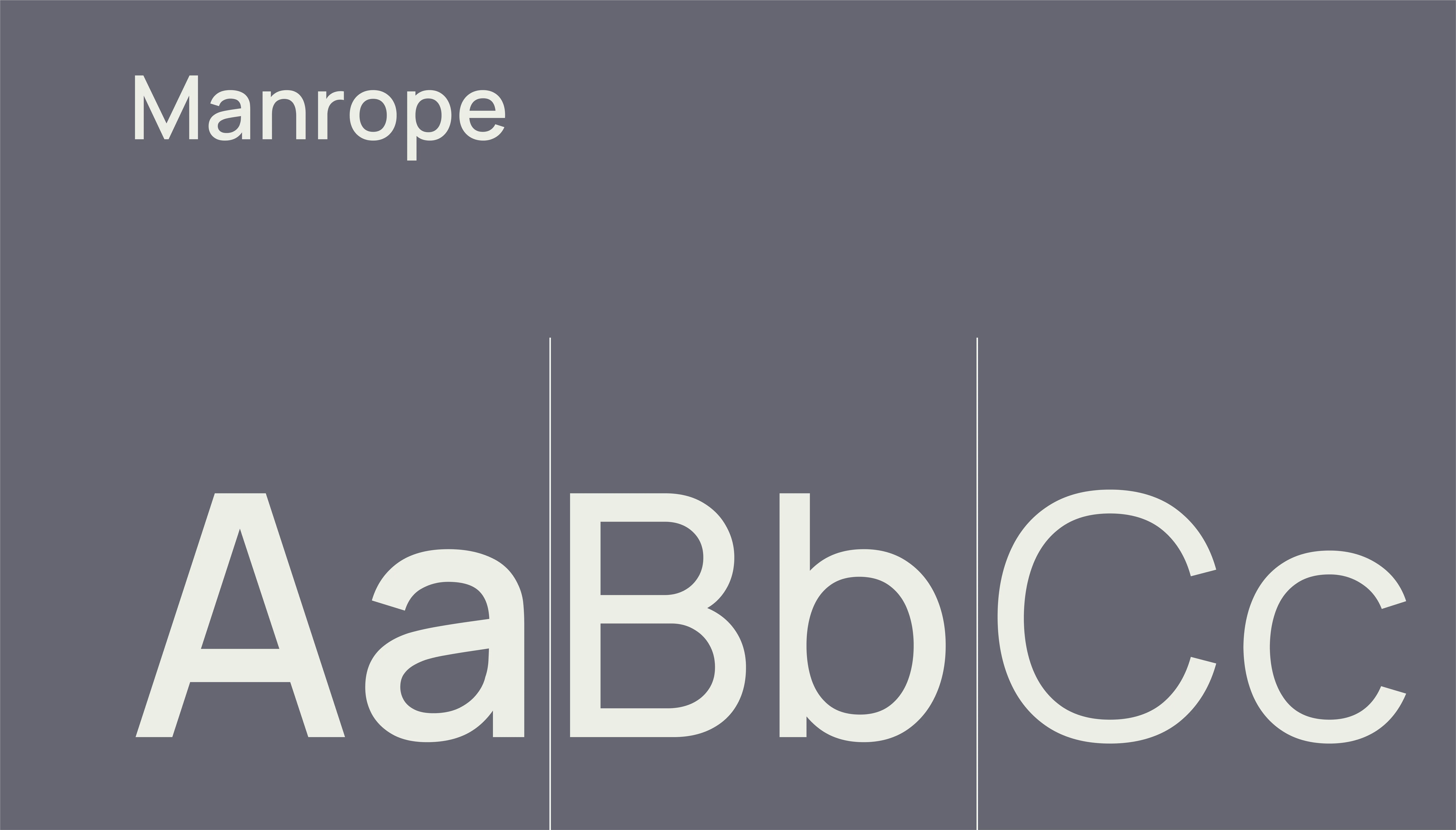
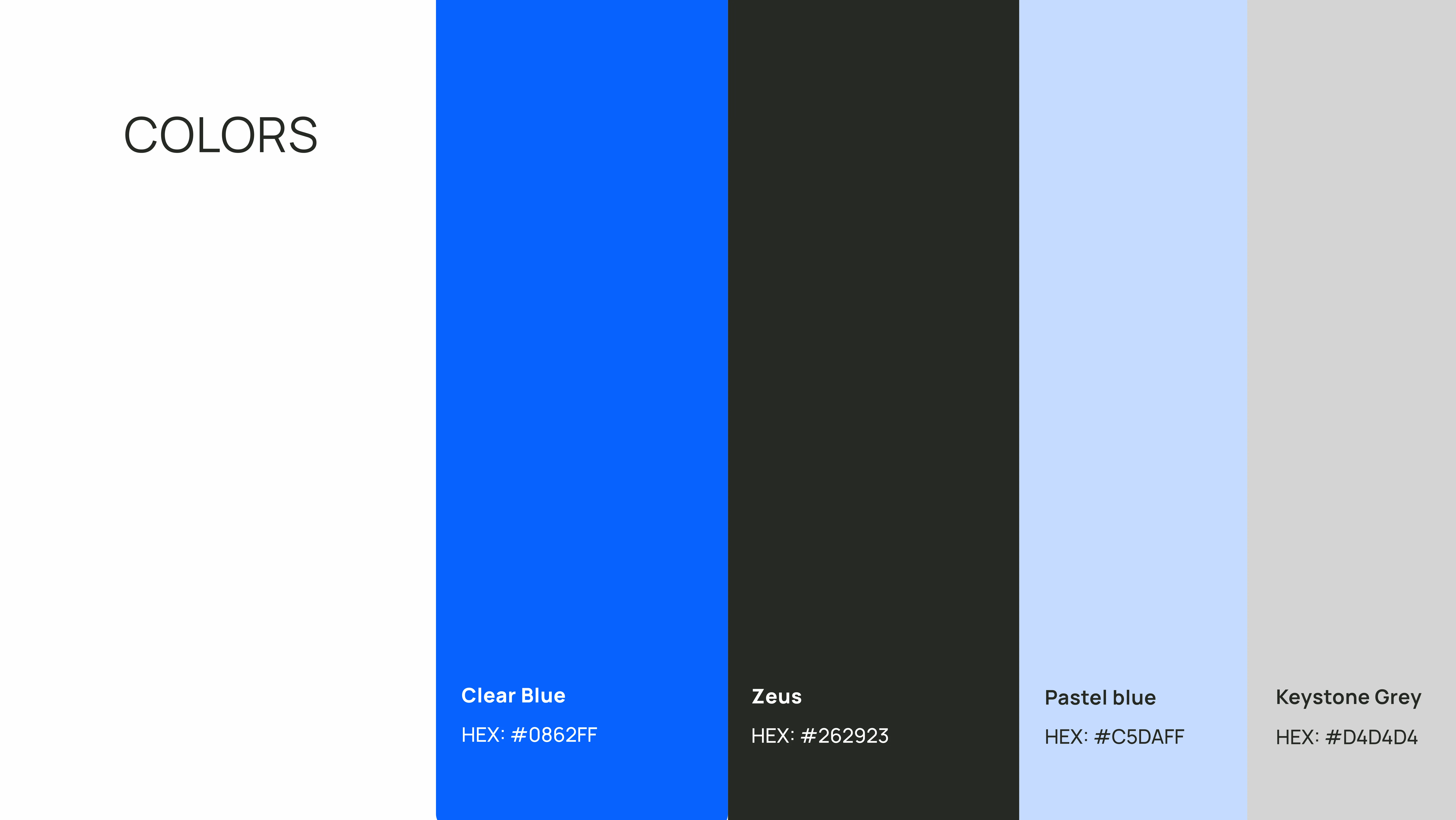
Armed with those insights, I crafted a visual strategy: a bold blue palette for reliability and clarity, anchored by dark contrasts for strength; geometric shapes to represent streamlined shipping paths and parcel management; and Manrope typography for professional precision with a friendly demeanor.
I designed the logo’s intersecting shapes to mirror parcels converging on efficient routes, reinforcing GetShip’s promise of seamless logistics. The choice of vibrant blue speaks to trust and transparency in every transaction, while the darker tones ground the brand in authority and dependability.
Each element emphasizes scalability and an intuitive user experience—mirroring GetShip’s dedication to efficiency and client success.
The result is a simple, versatile identity that stands out in the logistics landscape, clearly communicating GetShip’s confidence, integrity, and innovative edge to businesses seeking dependable shipping solutions.