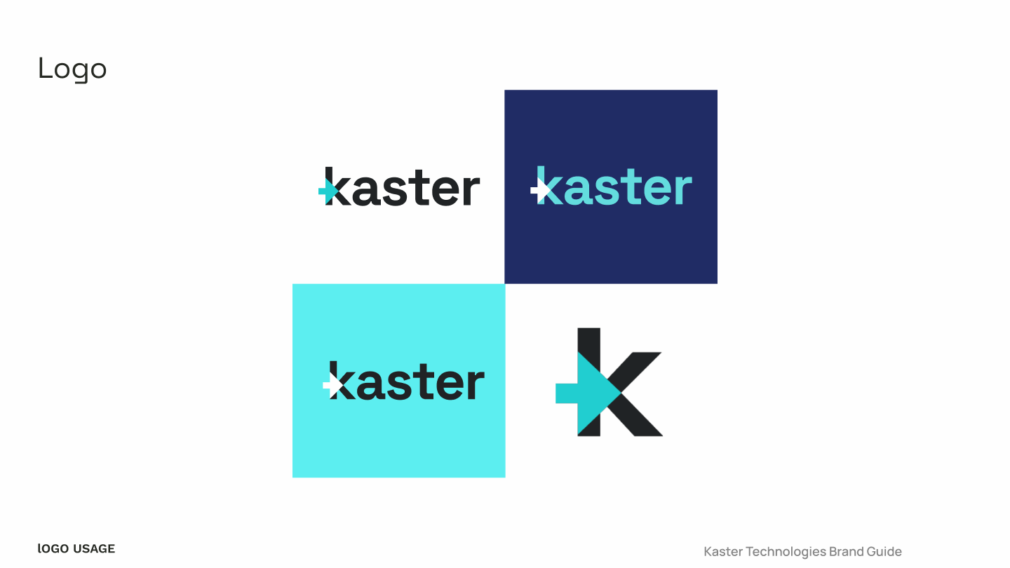
Brand Identity for Kaster Technologies
- Brand Designer
- Web Designer
- Visual Identity System
- Website UI
- Collateral & Social
- Figma
- Adobe Creative Cloud
- Webflow
Overview:
Kaster is an innovative software solution designed for medical manufacturers, focusing on optimizing production scheduling and efficiency.
Based on an in-depth brand brief and thorough competitive visual research, I identified customer pain points, key industry trends, and visual cues that resonated with the target audience.The design targets B2B clients in the medical manufacturing sector who prioritize reliability and innovation.
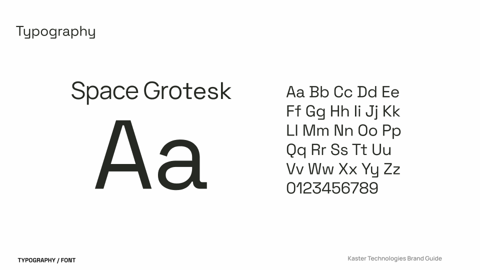
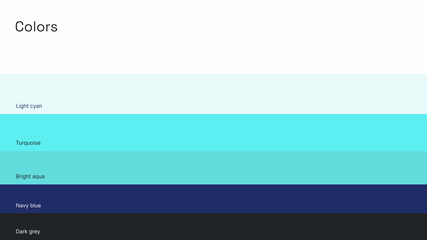
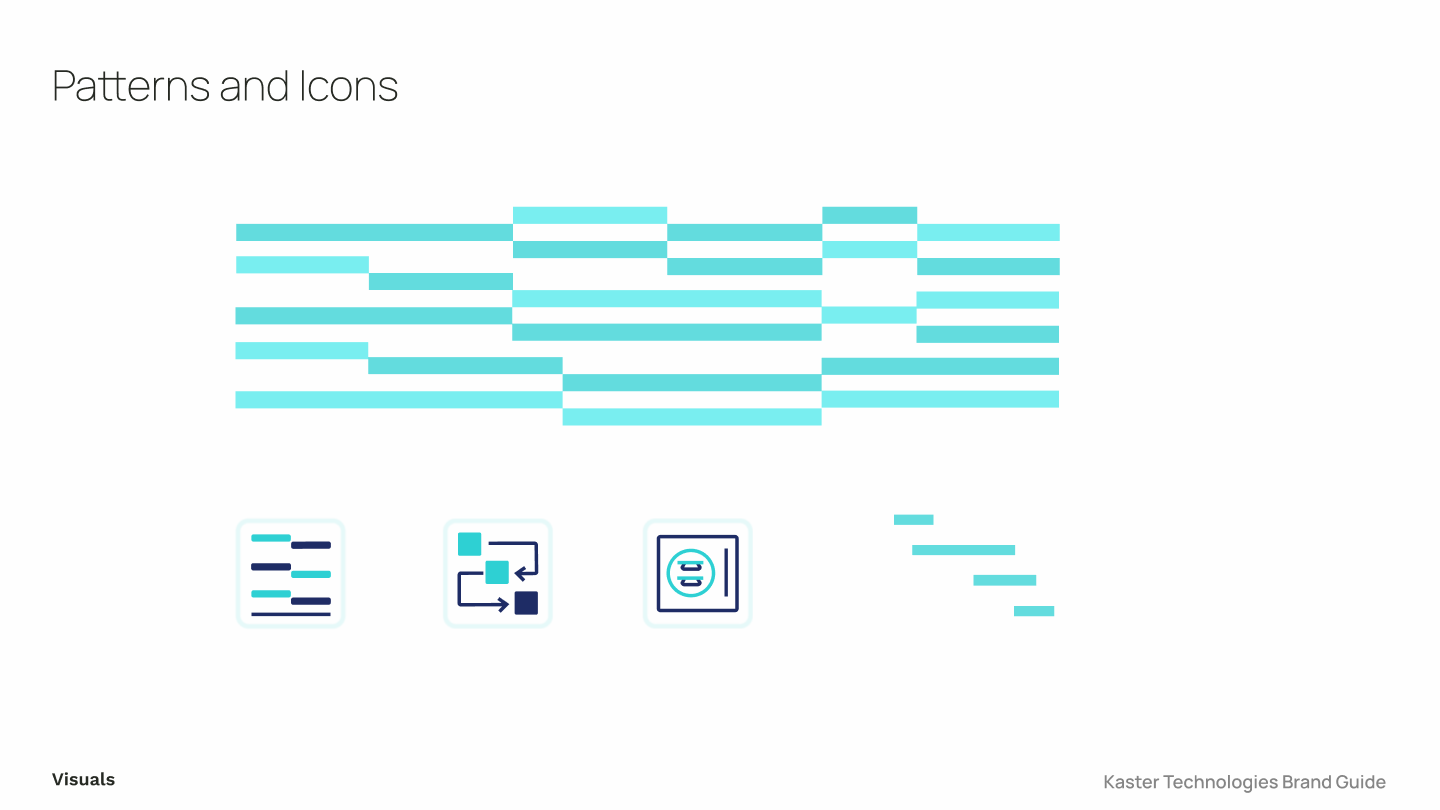
Drawing from Gantt charts, I used structured line elements to signify precision, balanced by a turquoise and mid-blue palette for growth and trust. Space Grotesque typography ensured readability and complemented the clean, geometric style.
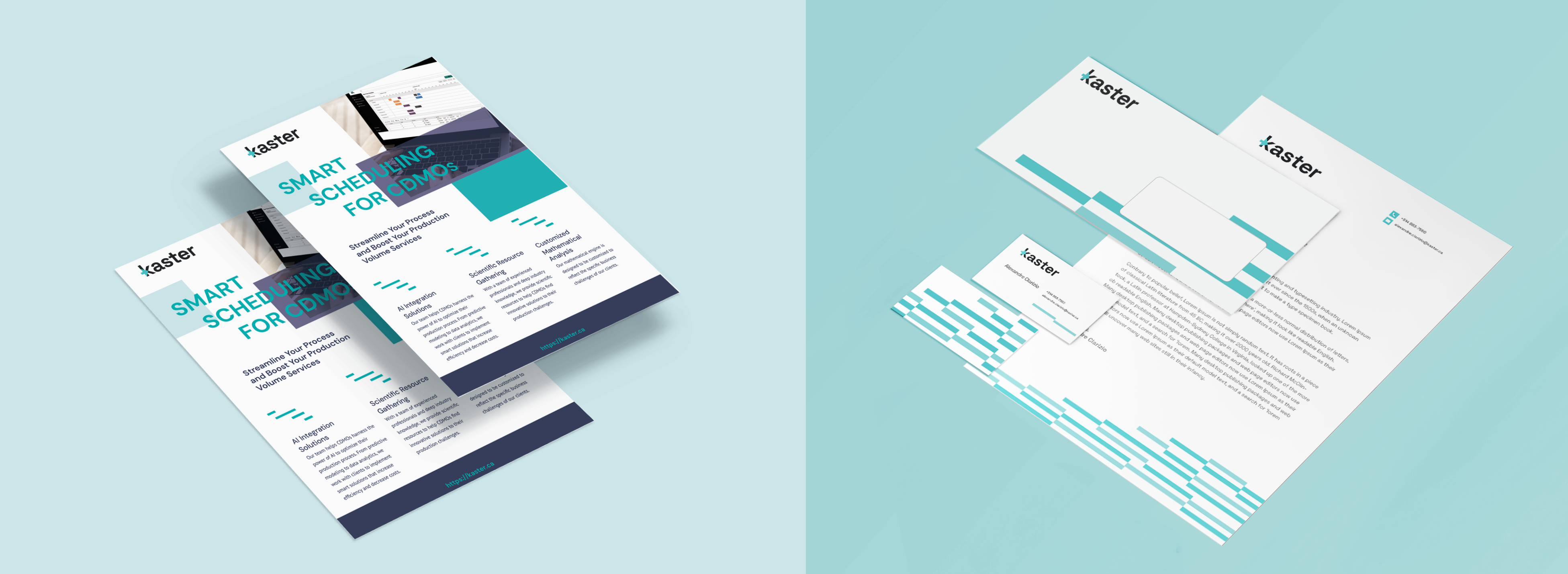
The design featured high contrast for clarity and was adaptable across various mediums. I developed a visual identity guidelines and assets for Kaster, including a new website built using Webflow.
The result was a cohesive, professional identity that reinforced Kaster's image as a trusted, forward-thinking leader, enhancing client engagement and market visibility.
Overview
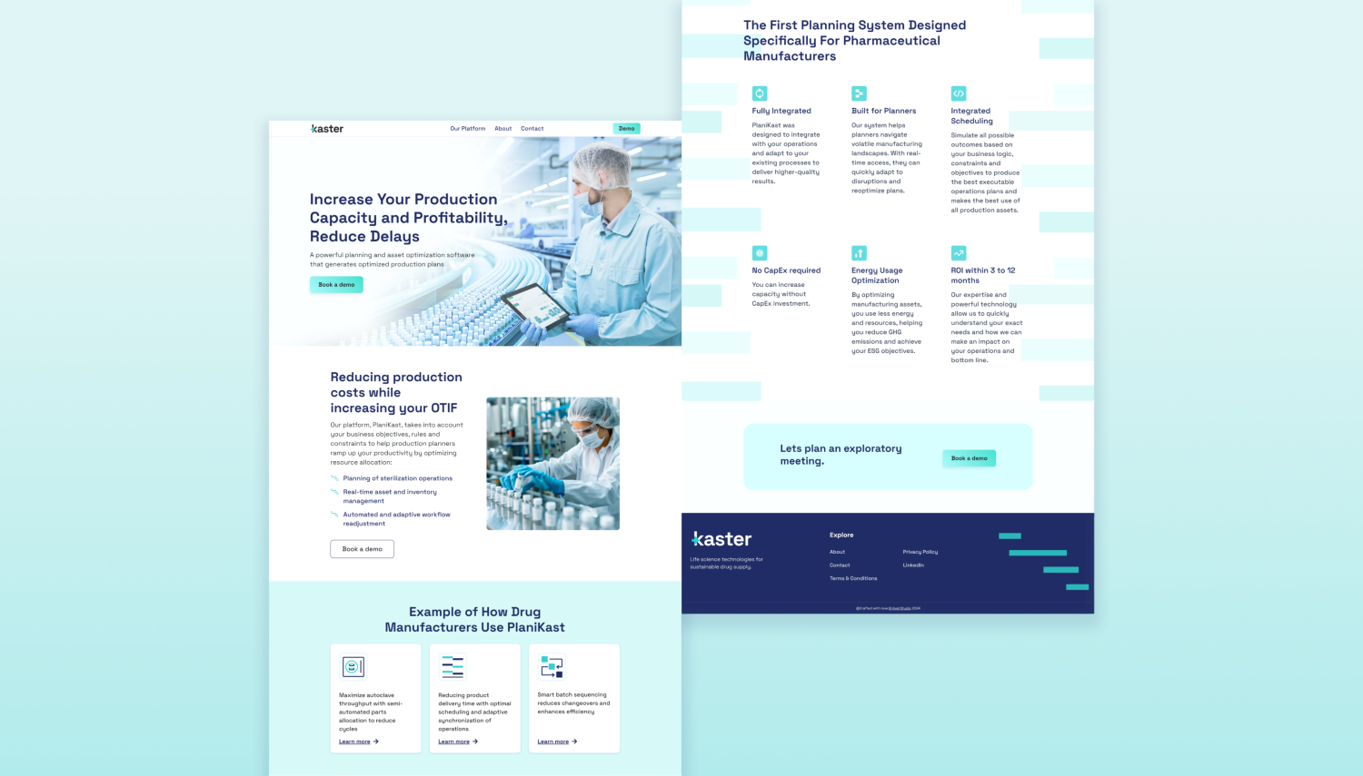
Kaster is an innovative software solution designed for medical manufacturers, focusing on optimizing production scheduling and efficiency. For the Kaster website, the goal was to establish a professional, high-trust, and innovation-driven digital presence that aligns with its B2B pharmaceutical audience.
Strategic Approach & Prioritization
Before diving into design, I first structured the content hierarchy to ensure a logical information flow, prioritizing:
- Clear messaging: about Kaster's value proposition to quickly convey its benefits.
- Visual storytelling: with data-driven elements like Gantt chart-inspired lines, reinforcing the precision and efficiency of its scheduling solutions.
- Easy navigation: to help decision-makers access relevant information quickly.
- High readability: with grid-based layouts, whitespace, and high text-background contrast, ensuring clarity for technical content.
Once the content structure and messaging framework were mapped out in text-frame, I designed the homepage in Figma, refining the visual direction based on feedback before translating it into Webflow for full development.
Key Visual & UX Elements
- Gantt chart-inspired lines: Representing precision and structured workflows, reinforcing Kaster's expertise in scheduling optimization.
- Turquoise and mid-blue color palette: Symbolizing growth, harmony, trust, and expertise, resonating with the medical manufacturing sector.
- Space Grotesque typography: Selected for its bold, tech-focused look, aligning with Kaster's modern, data-driven approach.
- Responsive, grid-based layout: Ensuring a seamless experience across all devices, critical for decision-makers who may browse from desktops and tablets.
Results & Impact
The final website successfully positioned Kaster as a leader in its industry, leading to:
- ✅ Increased website traffic and engagement, enhancing brand visibility.
- ✅ Stronger client relationships, reinforcing trust through a professional digital presence.
- ✅ Higher prospect interest, supporting business growth and lead generation.