Annual Report Design for BBBSWI
Brand visual identity and annual report layout design for nonprofit organization.
Service
Marketing Materials
Category
Layout Design
Industry
Nonprofit Organization
year
2023

Project Overview:
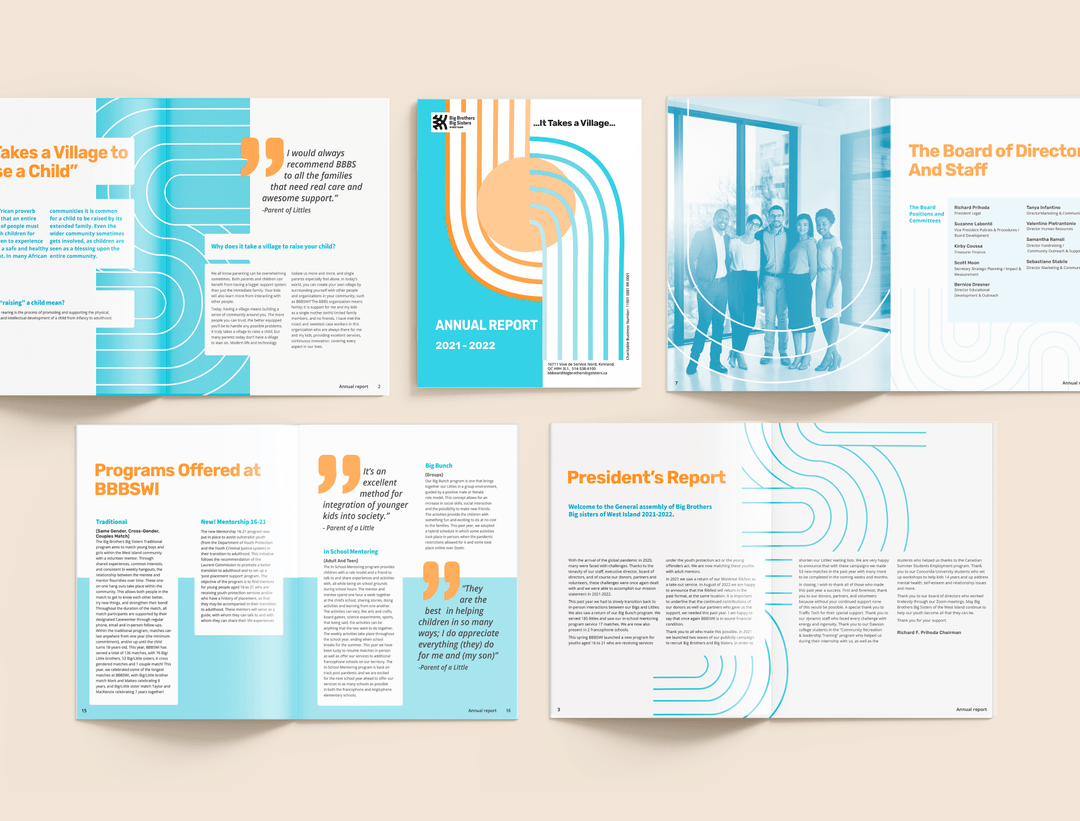
The purpose of the rebranding initiative for Big Brothers Big Sisters was to rejuvenate the brand's visual identity, aligning it with the mission of fostering empowering relationships for young individuals.
Design Approach:
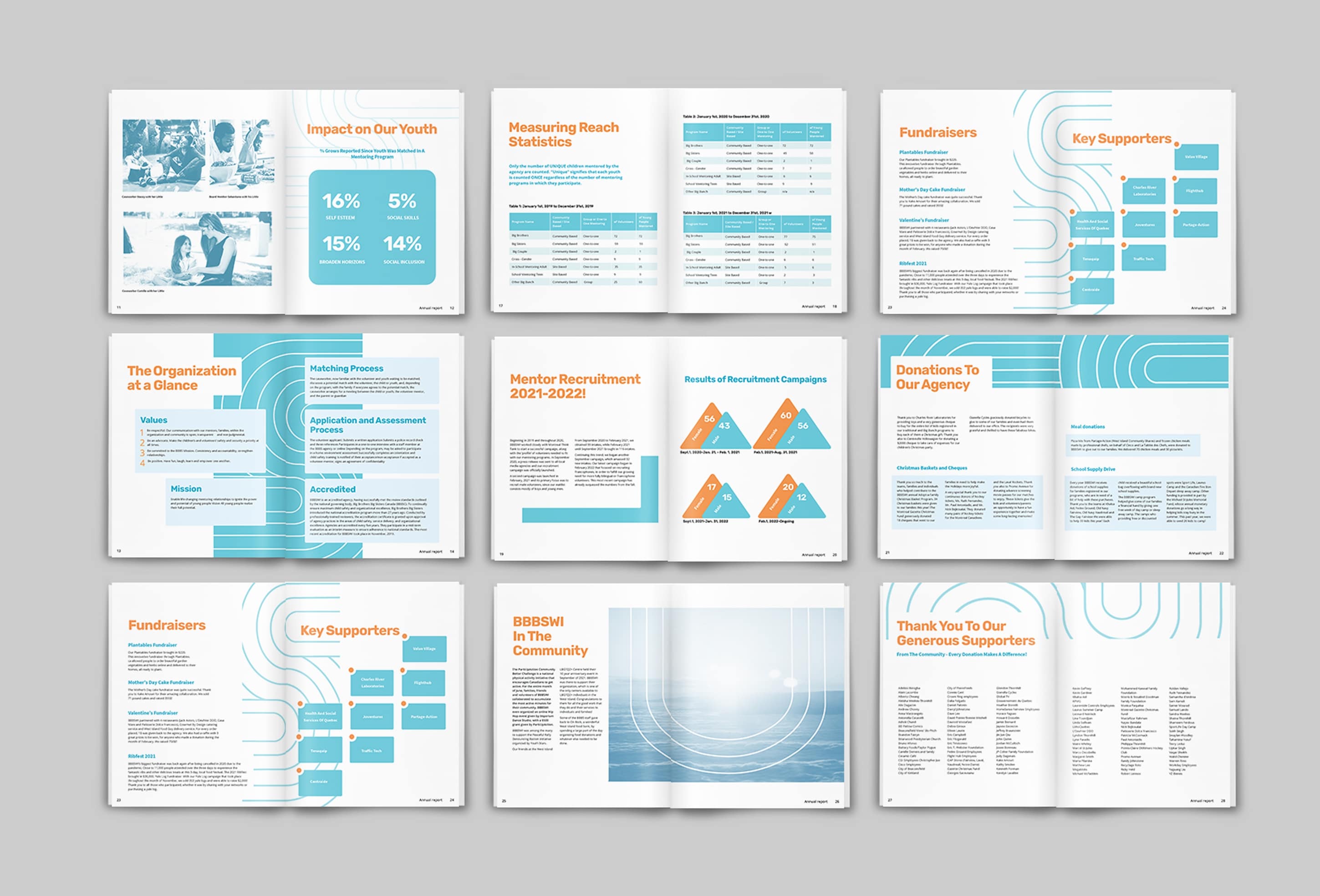
The aim was to maintain the essence of the established brand while incorporating innovative graphic elements. The design featured rounded, bold lines that formed patterns, as well as circles and overlapping shapes to guide the viewer's gaze. These elements symbolized the interconnectedness and collaborative foundation of the organization.

Result:
The design concept was developed to convey the connection and collective growth, resonating with the organization's core values of mentorship and community support.

