Brand Identity Design for Savio
- Brand Designer
- Web Designer
- Visual Identity System
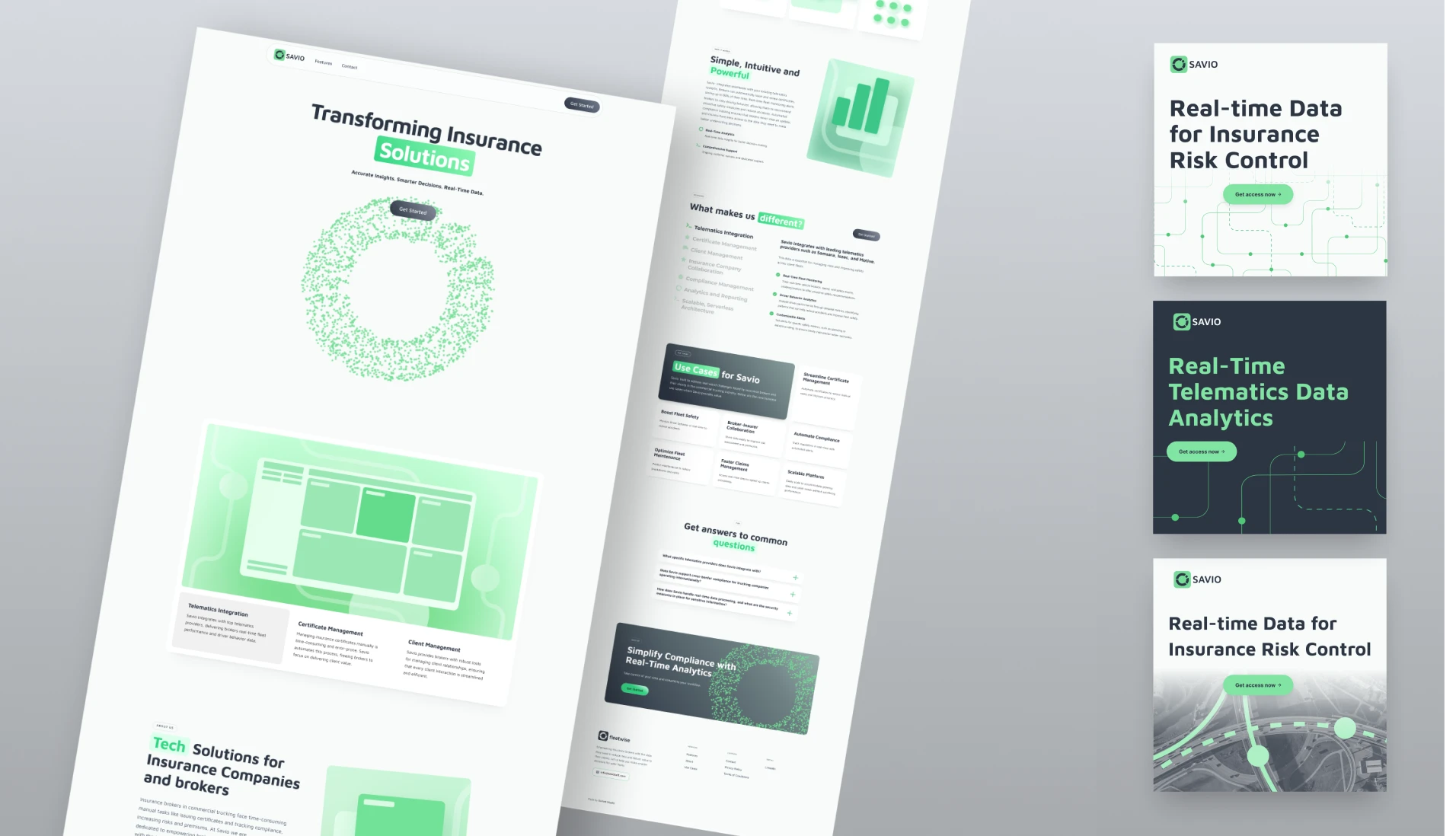
- Website UI
- Sales Deck & Social
- Figma
- Adobe Creative Cloud
- Webflow
- Spline
Overview:
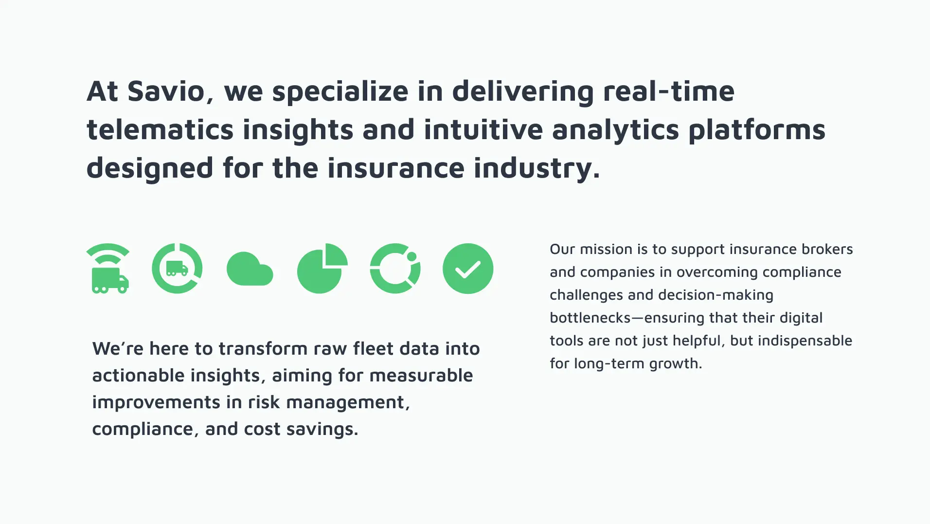
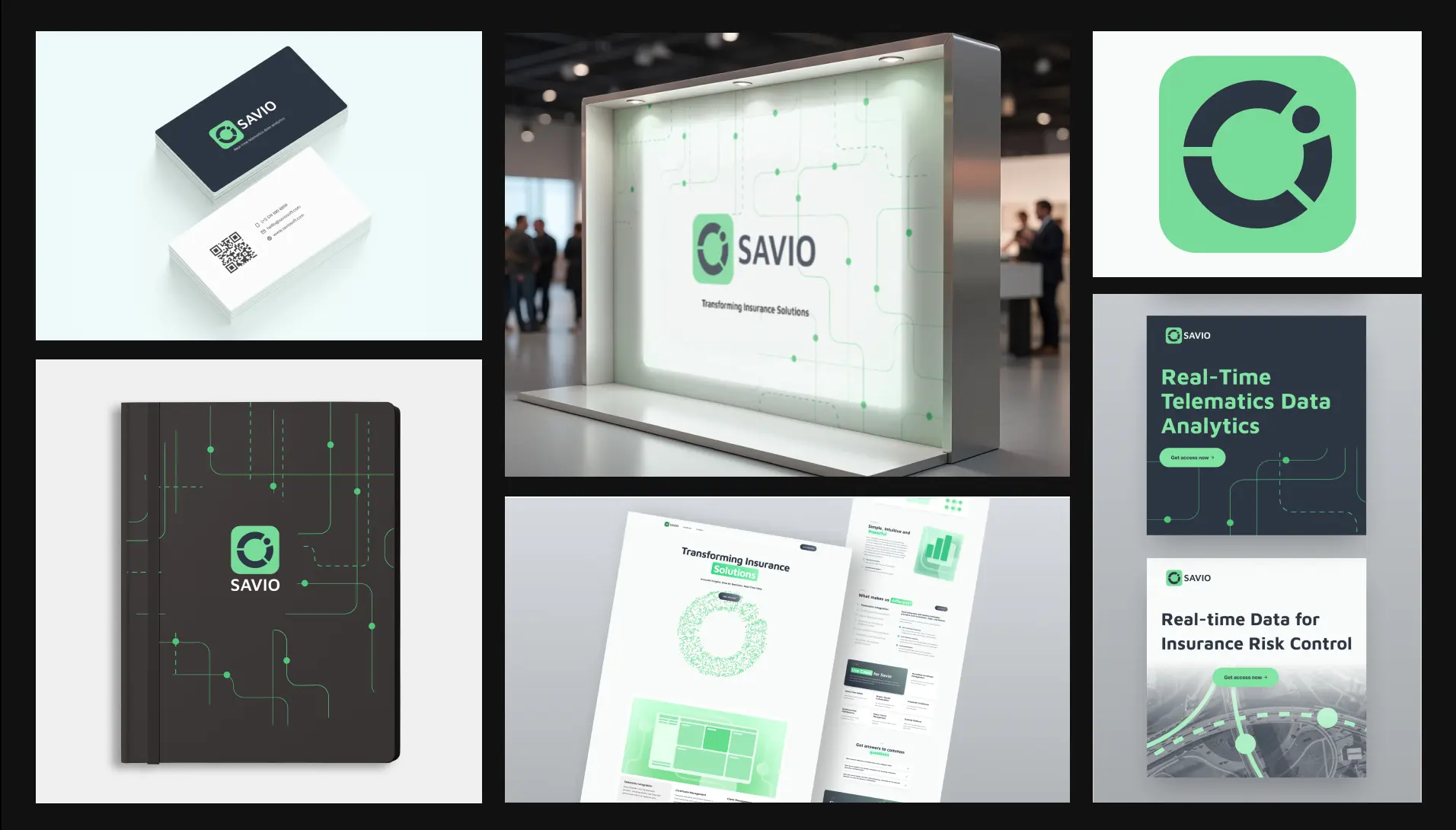
When Savio came to me, they needed more than a logo—they needed a story that would resonate with insurance companies overseeing cross-border trucking. The brand had to feel both cutting-edge and trustworthy, transforming complex telematics data into clear, actionable insights.
I began by interviewing the founder to capture Savio’s vision and pain points: fluctuating risk, slow reporting, and the demand for real-time clarity. Next, I dove into competitive visual research, uncovering the industry’s color conventions and data-centric motifs that inspire confidence.
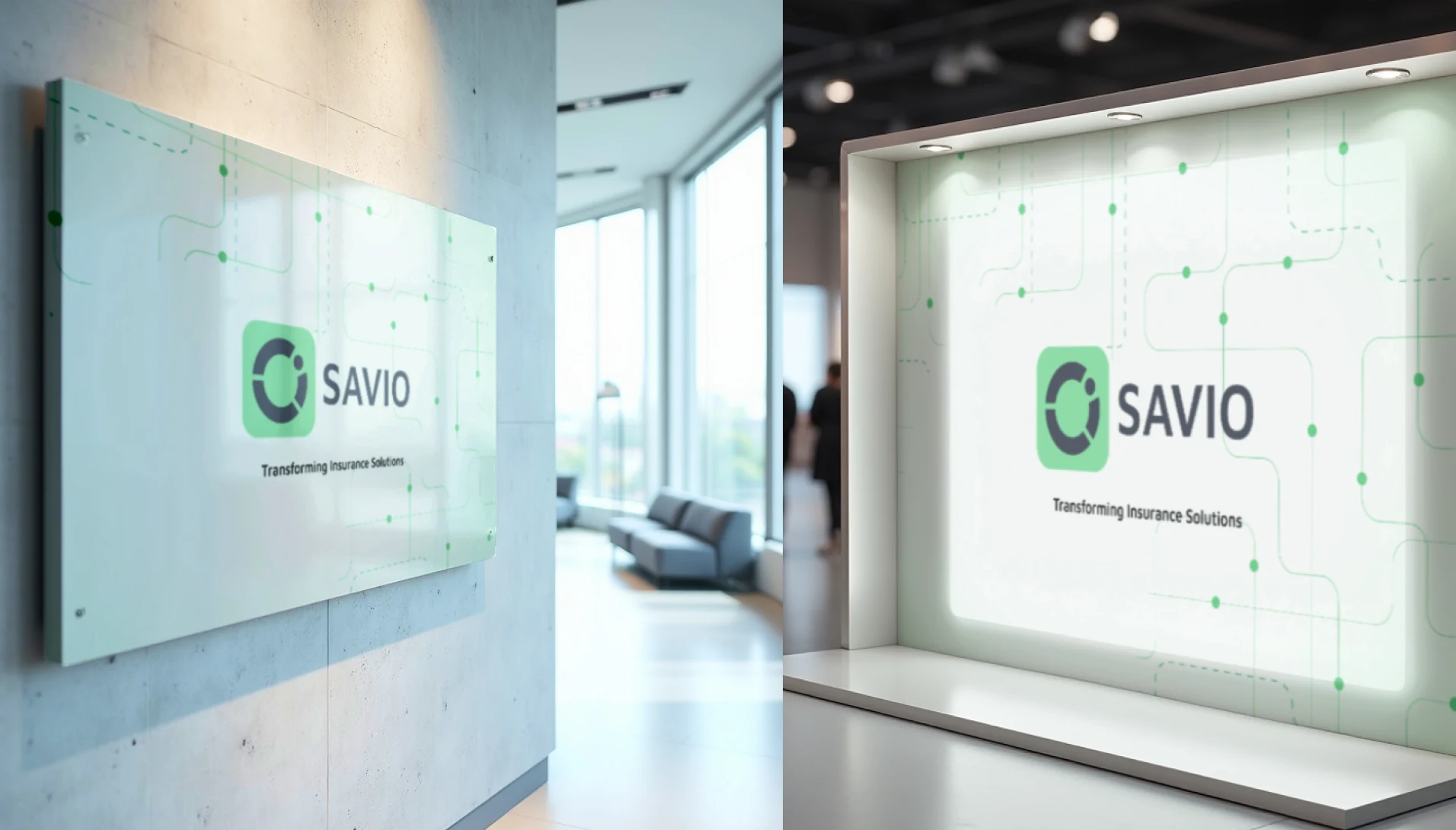
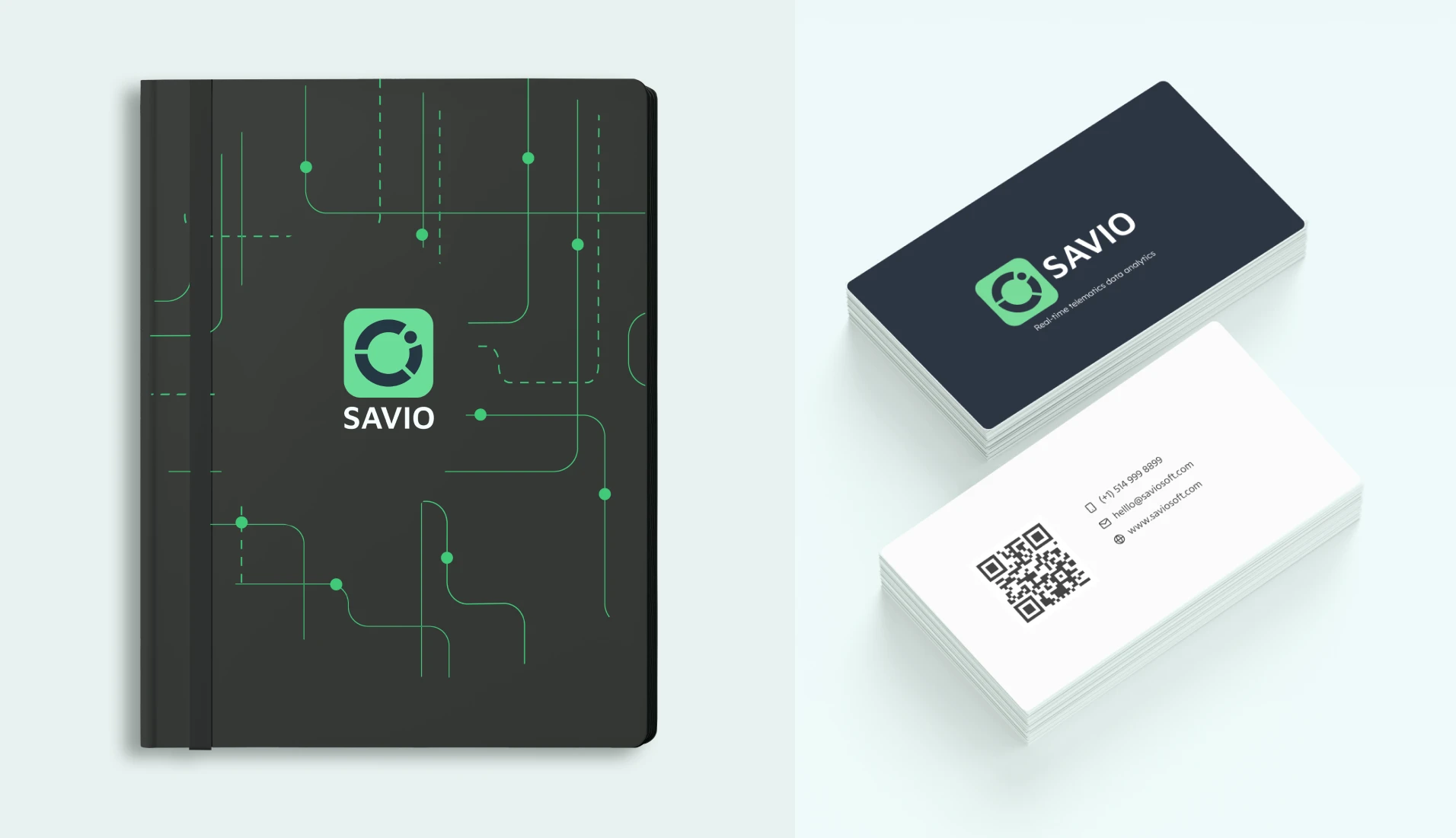
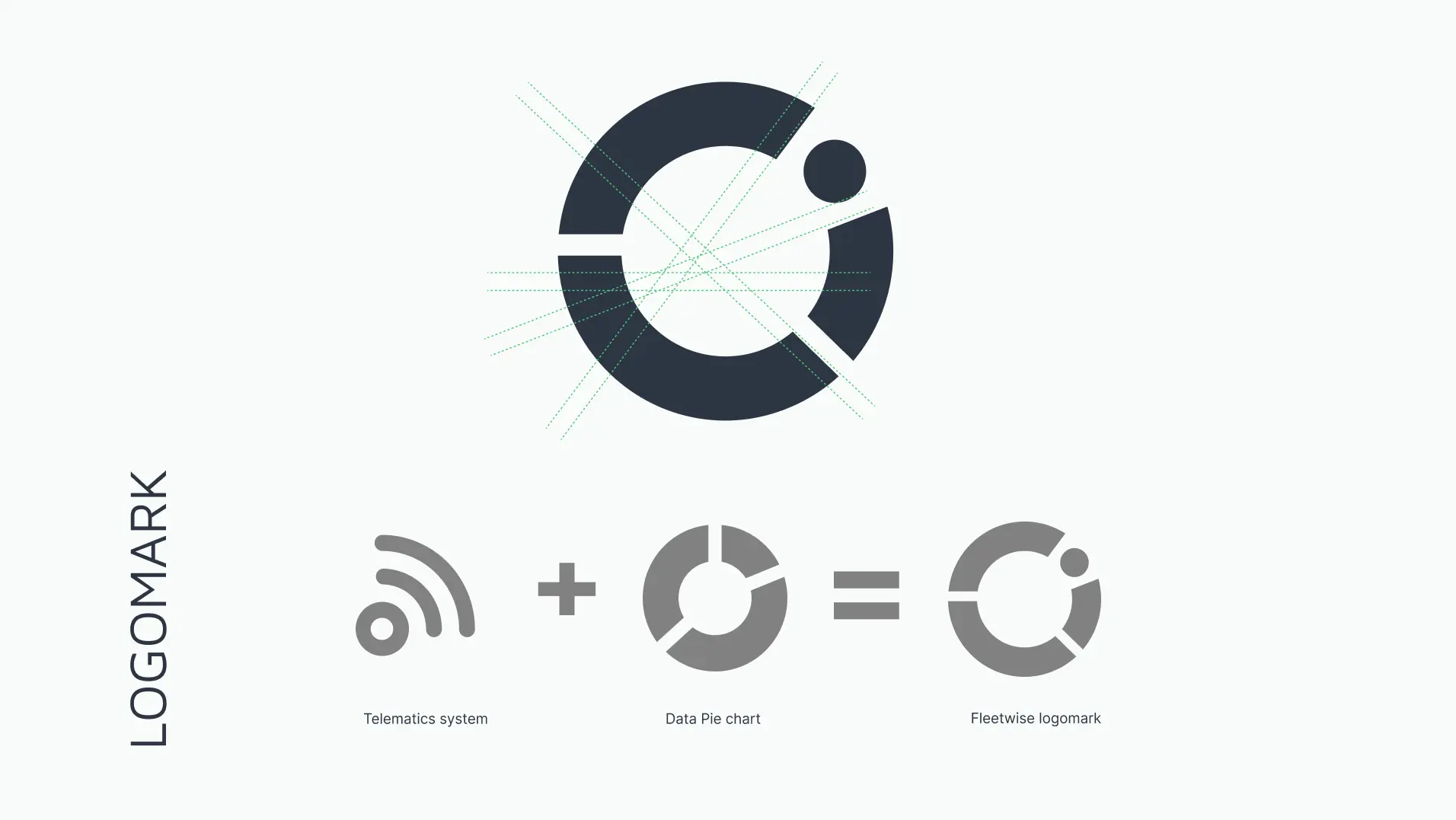
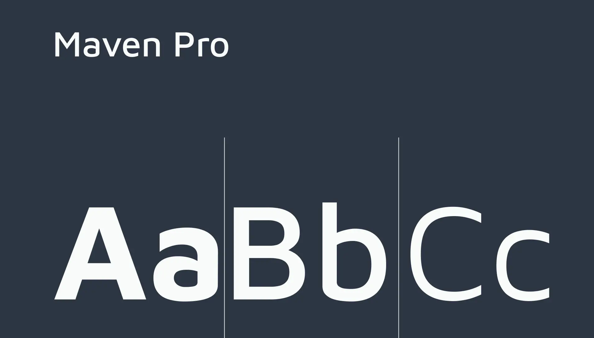
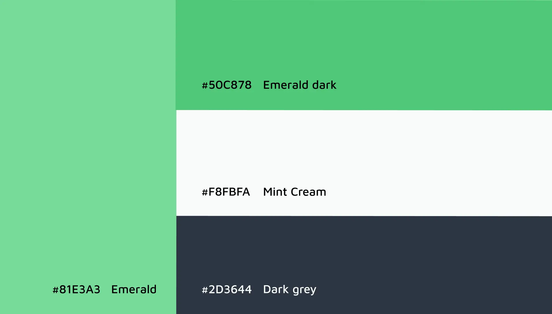
With those insights, I designed a wordmark that marries geometric shapes with pie-chart and signal elements—an emblem of connectivity and transformation. I chose an Emerald and Dark Grey palette, softened by Mint Cream White, to balance growth and professionalism. Maven Pro and Inter typefaces deliver legibility at every touchpoint, while a subtle lines-and-dots pattern (drawn from road networks and telematics signals) weaves a thread of precision throughout the brand.
I also developed an interactive HTML brand guidelines website, showcasing the new identity system and source files.
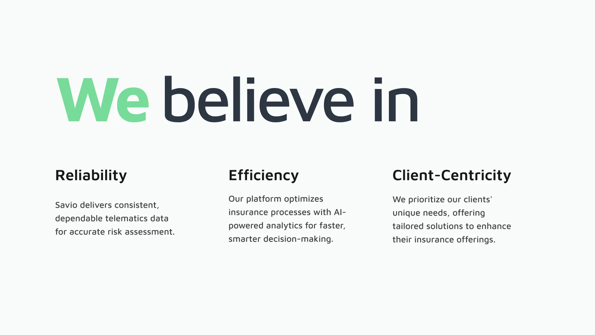
The result was a cohesive, client-centric brand that felt both reliable and innovative, earning praise from stakeholders and strengthening Savio’s position in the insurance analytics market.